Because newspapers were selling subscriptions long before digital media, the industry still relies on legacy customer management applications, that are not readily integrated with digital platforms or current e-commerce models. Our team was responsible for building a new system that provided potential subscribers an intuitive path to purchase access to metered content. Our challenge was to coordinate information stored in multiple systems to ensure a seamless flow for both new customers and those who could have purchased a subscription at any time during our digital evolution.
UX Challenges
- A network of legacy applications for managing user data.
- Complicated flows for activating digital access to metered content
- Low adoption of digital products by existing print subscribers
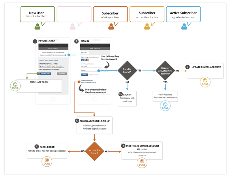
As the UX specialists for this project, I worked closely with the development, design and business channels. I started by drawing many journey maps to illustrate how users would encounter and navigate the interface to successfully purchase new subscriptions; activate an existing subscription or update previous accounts in our new system. The above is a sample of one of those journey maps.
Create wireframes. Test. Repeat.
We know many competitors practice usability testing, which we could use to advance our understanding of the user’s mental model around subscription flows. We started out by testing the interface of several news sites with users, to see what worked well, and what we could improve. This brought us to our first set of wireframes.
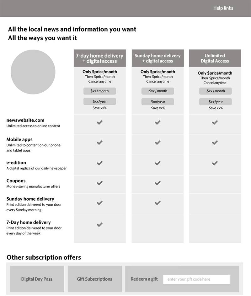
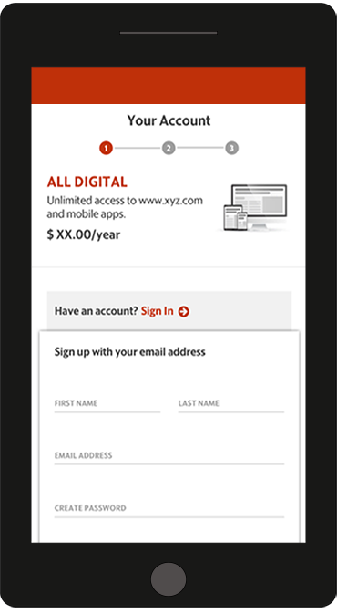
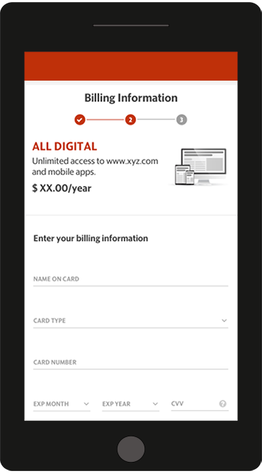
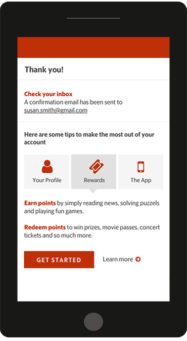
The final prototype
After many iterations with feedback from users and internal stakeholders, we developed our final prototype for testing and development. This is the site we launched with in April of 2017.
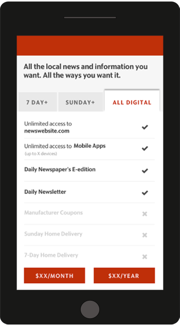
UX Highlights
- The page is designed to give users all the information they need to decide on a subscription.
- We limited the number of subscription options to three. More options creates confusion with users, which effects conversions.
- Users can easily compare the features of each subscription offer, even when viewed on a mobile screen.
- Users are able to cancel their subscription any time after purchase. We know most do not cancel, but having that 'out' makes users feel more confident about continuing.
The rest of the purchase flow was simplified to carry users through the process quickly and efficiently. The results of our work was a significant increase in new subscription starts. We also saw an increase in activations of existing subscribers. The site will continue to be optimized through continuous a/b testing.